Free Org Chart Builder

Introduction #
In this guide, we'll be quickly transforming CSV data into insightful HR chart visualizations using the beginner-friendly Python Streamlit.
If you'd like to jump right in, you can fork the completed version of this app and run it right away here here:
This app has numerous applications, including visualizing sales and financial data, marketing campaign performance, survey results, healthcare patient information, and much more. In this example, we'll use it to analyze an HR employee report to uncover valuable insights.
Feel free to familiarize yourself with the Streamlit docs before we proceed.
While following along in the code if you ever need further explanation we recommend talking to Replit AI Chat in the workspace.
Setup Streamlit Template #
To begin, fork this template by clicking "Use Template" below:
Download the following CSV
Upload this to your Replit files. You should see it under main.py.
Using the Dependencies tab ensure you have the following packages installed.
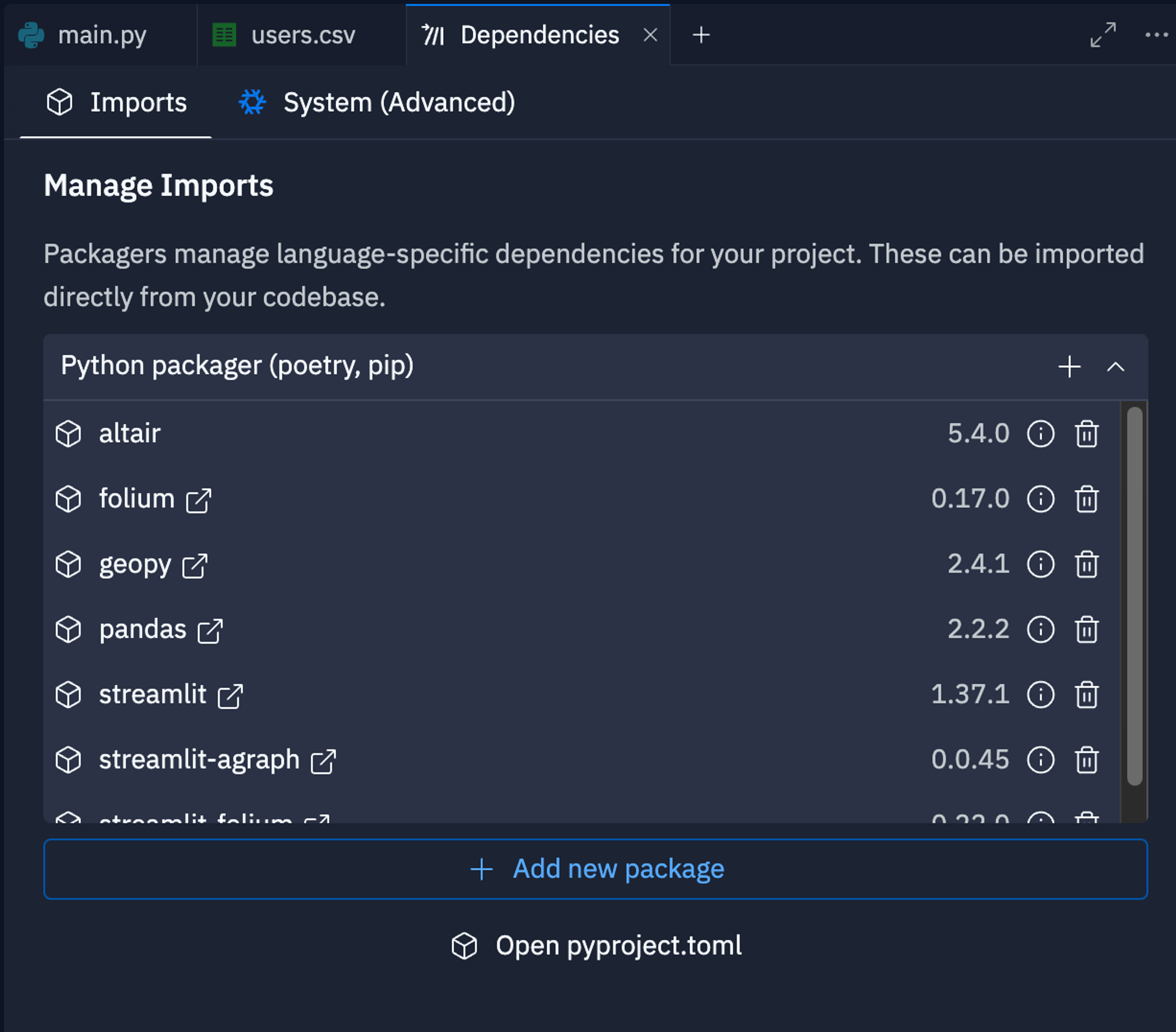
You can also edit these in your pyproject.toml file. The changes in that file will sync with your dependencies.
Read and View CSV #
The first step is to read the CSV file and display the raw data to the Webview tab. Streamlit makes it very easy to do this:
This code uses the popular pandas package (say that 3 times fast) to read the CSV into a DataFrame. We then use Streamlit (in our code, st) to display the raw data. Give it a shot!
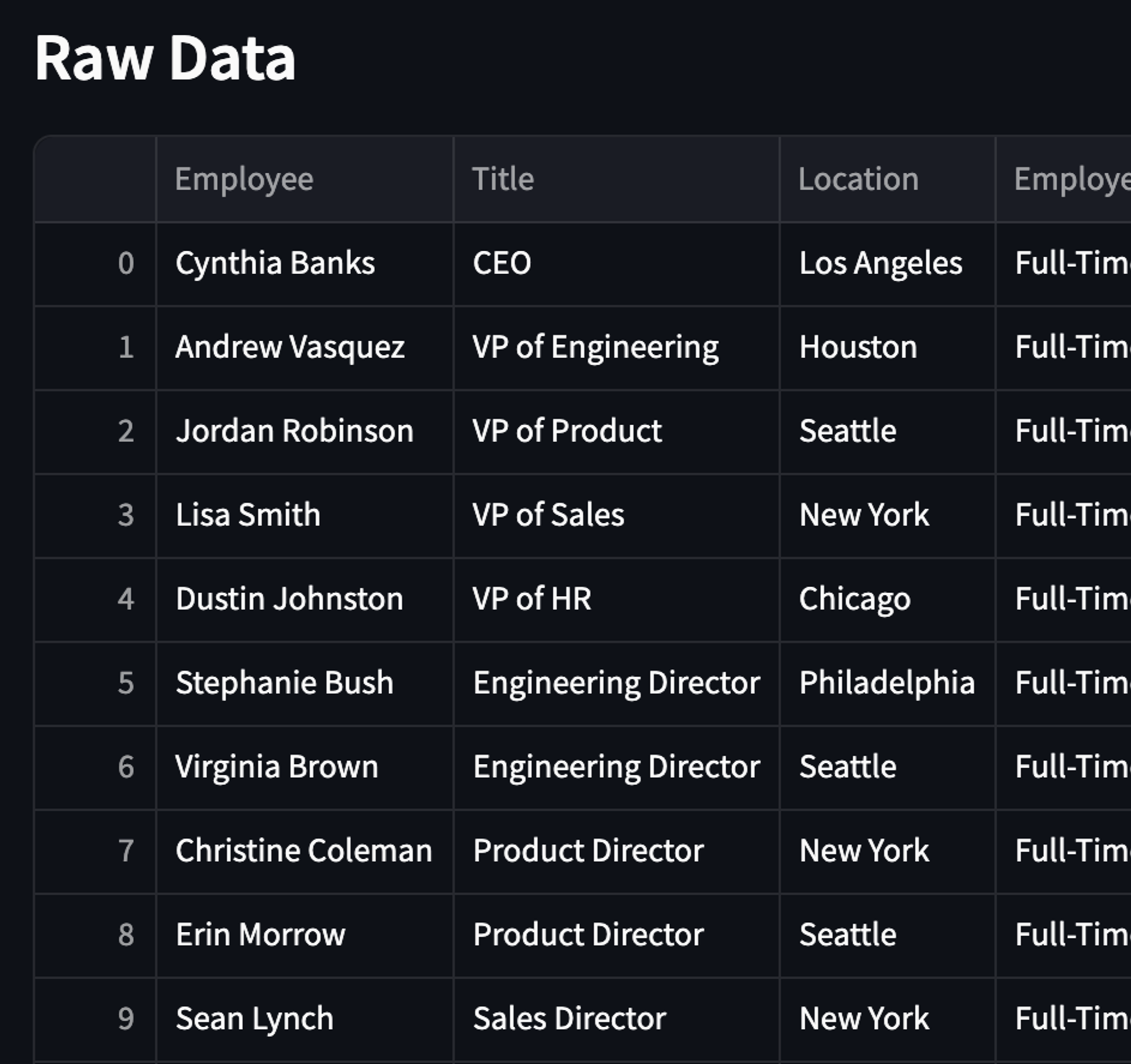
You should see the data shown above. Take a look at the different fields included here: Employee,Title,Location,Employee Type,Yearly Salary,Level,Department,Team,Manager,Start Date,End Date .
Before we proceed, we want to setup different pages for all the charts we’ll be taking a look at today. To do that we can simply add a sidebar element with radio buttons:
And then right under this:
You should now see a sidebar with pages and headings next to the arrow on the top left:
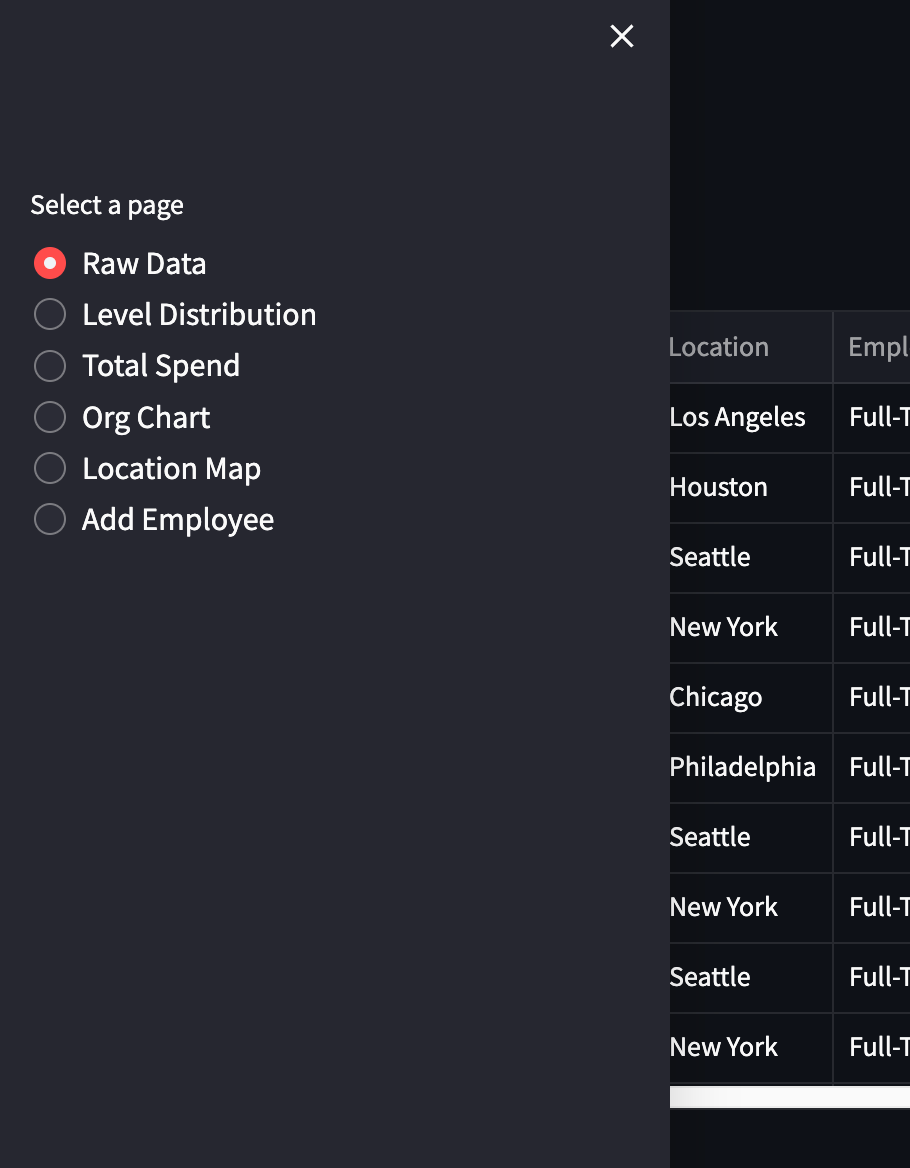
These are the following sections we’ll cover, all the related code will be constrained to each elif block.
Data Section #
We already have most of this section completed as you can see while viewing the Raw Data tab. Let’s try some calculations to familiarize ourselves with the data.
First let’s calculate the average salary of all employees:
Here, we’re making sure all salaries are typed as a float and then calculating the average. We then display the average using the st.subheader - which is essentially just text. The f before the string signifies that the string is a Python F-string or a “formatted literal string” to allow for variables within. We are also formatting the salary into a money-like format.
Next, let’s try calculating the average tenure:
Here we calculate the tenure by:
- Converting the 'Start Date' and 'End Date' columns to datetime format
- Calculating the difference between 'End Date' and 'Start Date' in days
- Converting the days to years by dividing by 365.25 (accounting for leap years)
- Calculating the mean of all tenure values to get the average
Pie Chart - Company Level Distribution #
Next, we’ll deal with our first chart: a basic pie chart showing the distribution of company levels in the organization.
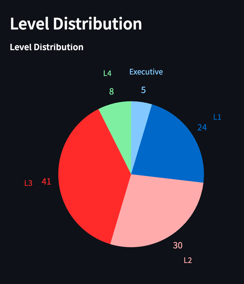
The first step is crucial, focusing on manipulating the level data for all employees.
Here we retrieve the count of each unique level in the Level column of the data DataFrame using data['Level'].value_counts(). We then reset the index of the resulting Series, creating a new DataFrame level_counts with columns for Level and Count. After this, we simply calculate the total percentage of levels.
Next, we setup the pie chart using the altair to create a pie chart using the counts data.
The mark_arc method is used to create the pie slices, and the encode method is used to map the data to the visual properties of the chart:
- theta is used to map the Count field to the size of the pie slices
- color is used to map the Level field to the color of the pie slices
- tooltip is used to display the Percentage values when the user hovers over the slice
After this, we add the text for the counts and levels. The code adds text labels to the pie chart using the mark_text function. The radius encoding is used to position the text labels at a fixed distance from the center of the pie chart, using a square root scale to adjust the spacing.
Finally, we display the chart with altair_chart using 2 layers, 1 for the actual pie and 1 for the text.
Bar Charts - Total Spend (Salaries) #
Next, we’ll go over bar charts to visualize total salary spend across different dimensions of the company. Bar charts are great for comparing quantities across different categories. Let's start with a chart showing total salaries by team:
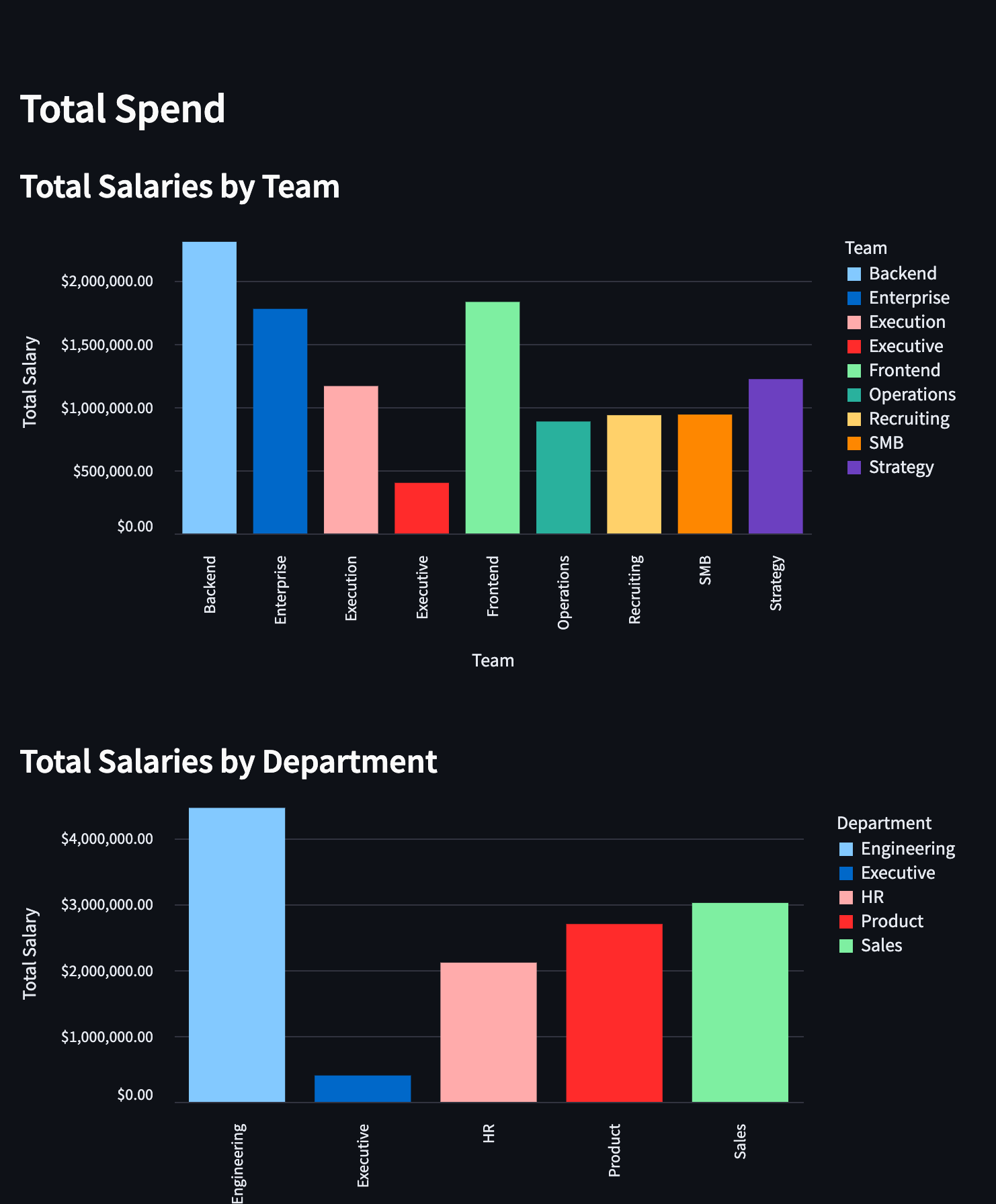
The code below is all you need to create a bar chart in Streamlit:
Here we’re first grouping the data by Team and then aggregated the sum of all the employees yearly summaries. Recall from the bar chart that reset_index() is used to create a custom salary_by_team DataFrame with Team and Yearly Salary columns. The next part is similar to the bar chart except we format the x and y axises to money.
Now, try creating a chart that shows salaries grouped by department, similar to the team-based chart we just made!
Forms - Add Employee #
Before diving into more advanced charts, let's create a Streamlit form for adding a new employee.
First, let’s build the actual form UI:
Here we define several constant arrays to be used as dropdown options for the employee type, level, department, team, and manager. Then we do the following to build the form:
- Inside the st.form() function, we define several input fields using Streamlit functions:
- st.text_input() for employee name, title, and location.
- st.selectbox() for employee type, level, department, team, and manager.
- st.number_input() for yearly salary.
- st.date_input() for start date and end date (optional).
The st.form_submit_button() function is used to create a submit button for the form.
However, you'll notice that the button doesn't actually perform any action yet. We need to connect it to the CSV file so it can write the new employee data. That’s where this next part comes in (note, put this outside of the with form statement from before):
The if statement is checking if the submit_button variable is True, which indicates that the user has clicked the Add Employee button to submit the form. We then create a dictionary new_user that contains the values entered in the form for the new employee. The keys of the dictionary correspond to the column names in the data, and the values are stored as lists (even though there is only one new employee). After that, we create a new Pandas DataFrame new_user_df using the new_user dictionary, concatenate it with the existing data and write to the file. Finally we give the user a little success confirmation message.
Give it a shot! You should now see the user added to the bottom row in the CSV.
Graphs - Company Org Chart #
Back to chart, let’s go over a slightly more complex kind of chart: a graph. A graph is essentially a collection of nodes and edges connecting them. In this case, we'll use a graph to create an organizational chart for our company. This will visually represent the hierarchical structure of the organization, showing the relationships between managers and their direct reports.
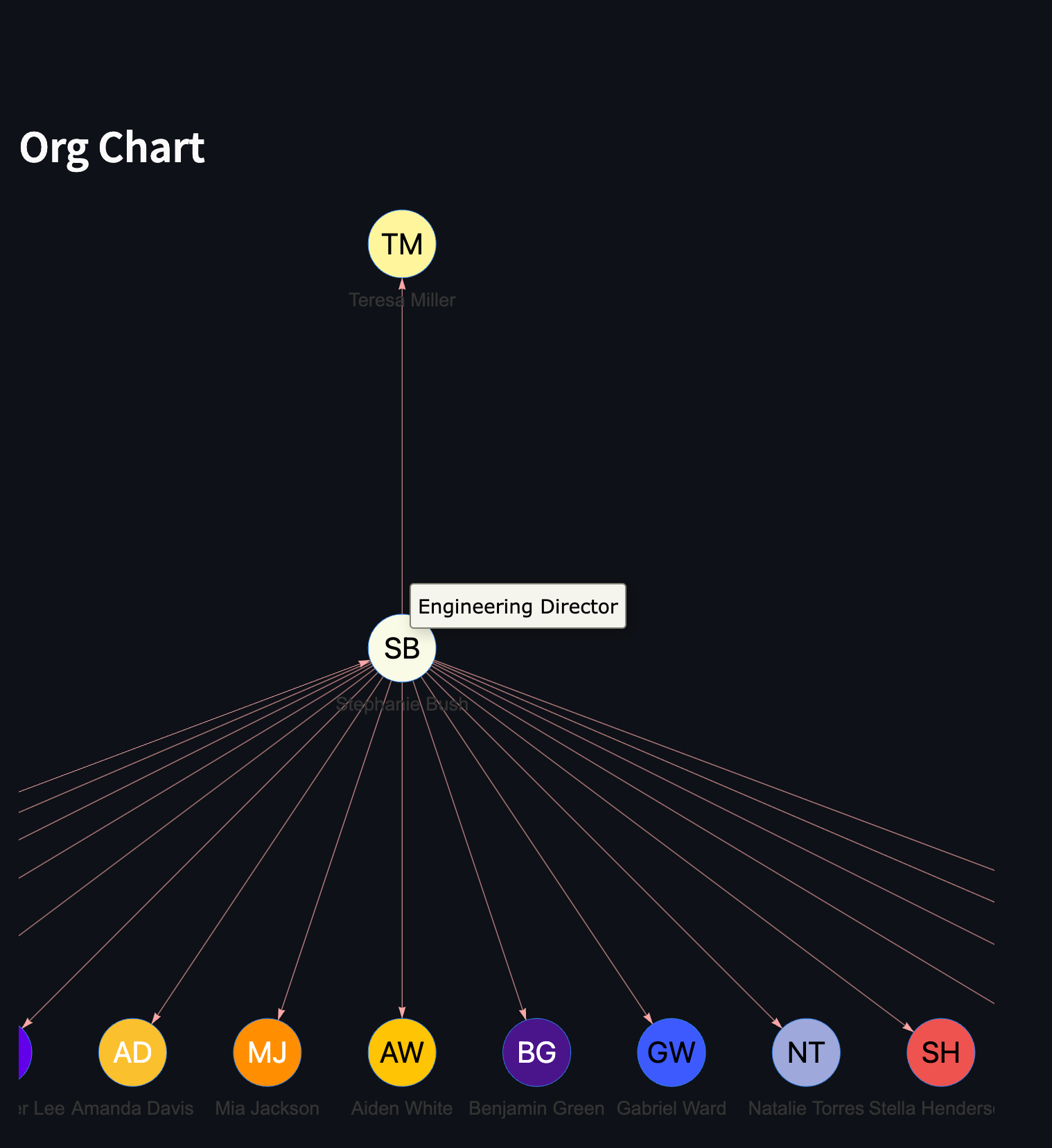
Let's take a look at the code to create this org chart:
In this code, we create nodes for each employee in the data:
- We iterate through each row in the data DataFrame.
- For each row, we create a Node object with the employee's name, title, and a randomly generated avatar image.
- We append each Node object to the nodes list.
Next, we create edges to represent the reporting structure:
- We iterate through the data DataFrame again.
- For each row with a non-empty 'Manager' column, we create an Edge object. The manager's name serves as the source, and the employee's name as the target.
- We append each Edge object to the edges list.
Finally, we configure the graph with certain stylistic choices. Try messing around with the settings to see what changes! agraph here is from the user-made Streamlit component streamlit_agraph that helps us visualize graphs very easily. Learn more about Streamlit components here.
Maps - Employee Locations #
The final type of visualization we'll cover is mapping employee locations.
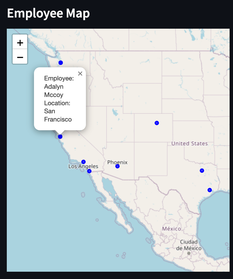
The locations of users right now are only saved as strings, ie “San Francisco” or “Houston”. In order to find the latitude and longitude here, we’ll need to do the following:
This function will gives us back the coordinates if it’s not already in the coordinates_dict dictionary. The reason this dictionary exists is to cache the results of geocoding operations. Geocoding can be a slow and rate-limited process, so caching the results helps improve performance by avoiding unnecessary repeated lookups for the same location. This is especially useful when dealing with multiple employees in the same city or region.
Now, let’s check out the full map chart code:
Create a Folium map:
- Get the location of the first employee from the data DataFrame and use it as the map's initial center.
- Create a Folium map object m with this initial center and a zoom level of 4.
Add circle markers for each employee:
- Iterate through each row in the data DataFrame.
- For each row, we obtain the coordinates for the employee's location using the get_coordinates function.
- If coordinates are found, we add a Folium CircleMarker to the map, specifying the location, radius, popup (showing employee name and location), color, and opacity.
Display the map in Streamlit:
- We use the st_folium() function from the Streamlit Folium component intergration to display the map in the Streamlit app, setting the width to 700 pixels and height to 500 pixels.
Deploying Your App #
In order to keep your app running and allow others to visit it 24/7, you'll need to deploy it on a hosted server.
Open a new tab in the Workspace and search for “Deployments” or open the control console by typing ⌘ + K (or Ctrl + K) and type "deploy". You should find a screen like this.
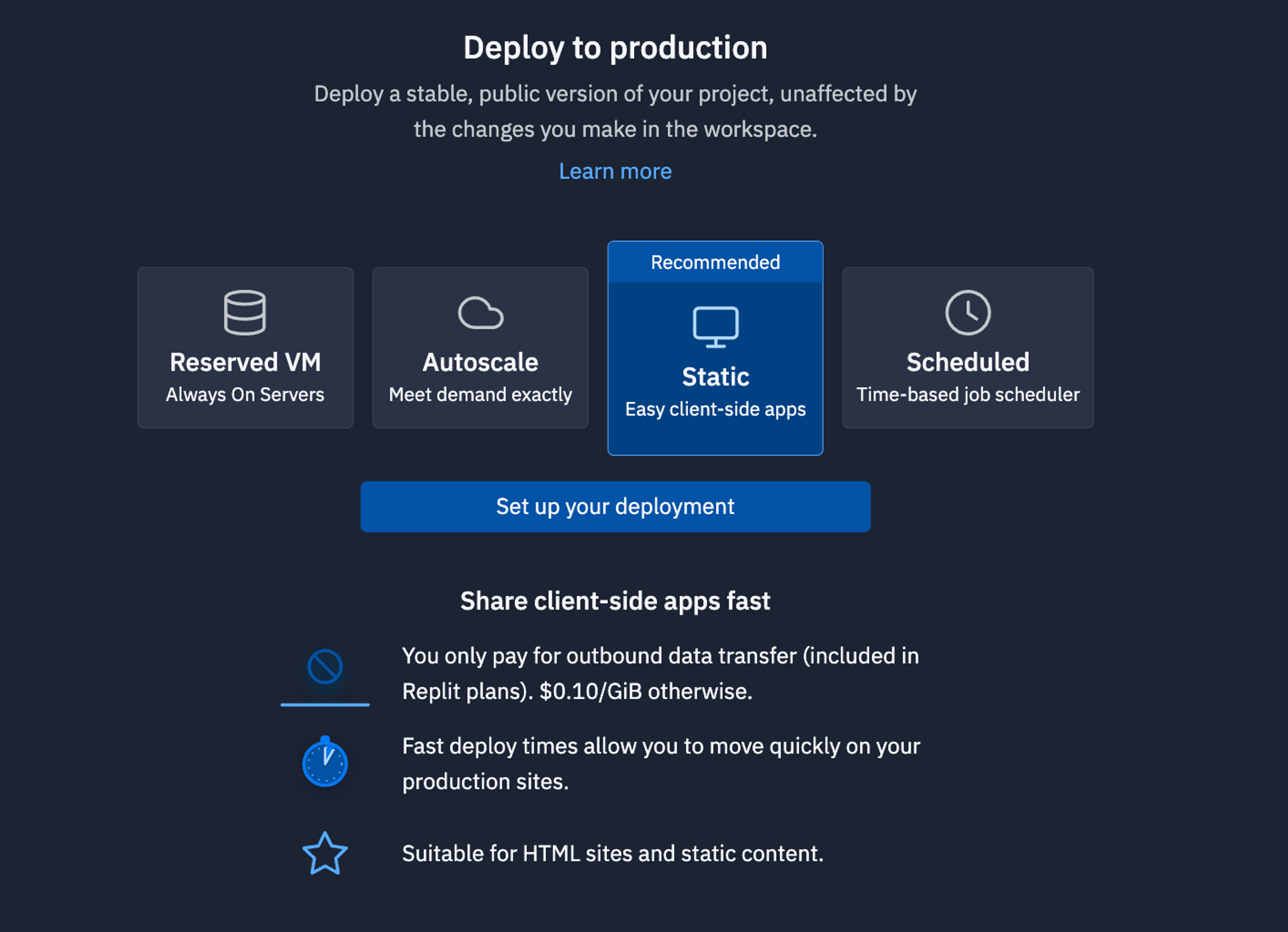
For apps like this that need always need to be up listening to requests, we recommend using a Reserved VM. On the next screen, click Approve and configure build settings most internal bots work fine with the default machine settings but if you need more power later, you can always come back and change these settings later. You can monitor your usage and billing at any time at: replit.com/usage.
On the next screen, you’ll be able to set your primary domain and edit the Secrets that will be in your production deployment. Usually, we keep these settings as they are.
Finally, click Deploy and watch your app go live!
What's Next #
You now know how to use Python and Streamlit to visualize data from a CSV and deploy it as a hosted web app for others to see!
If you’d like to bring this project and similar templates into your team, set some time here with the Replit team for a quick demo of Replit Teams.
Happy coding!