

Mobile Website Builder
Build a mobile website in minutes for free with AI. Write in plain English or tap buttons to create your website.


How to Use the Mobile Website Builder
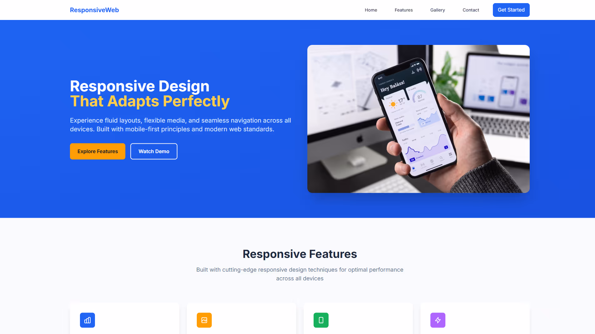
Mobile Website Builder Example
Built with Replit.
Build your vision in minutes for free without writing a single line of code.
Prompting the Mobile Website Builder
Build a responsive mobile website using a fluid percentage-based grid for automatic content reflow, flexible media with max-width to scale images and videos without overflow, responsive navigation that collapses from full-width bars to a hamburger menu, and properly tuned viewport meta settings for initial scale and crisp rendering.
Build an adaptive site that uses server-side detection (user agent/feature hints) to load predefined device-specific layouts, delivers only conditional assets (device-appropriate images, scripts, styles) per segment, and snaps designs to discrete breakpoints for precise control and optimized pre-rendered markup.
Create a mobile-first website project with real-time co-editing (live cursors), inline comments on specific elements/text ranges, presence indicators (avatars/status dots showing who’s online and where they’re working), and a version history logging timestamps/authors with easy rollbacks.
Build a mobile-first site that uses progressive enhancement, enforces strict JS/CSS/image performance budgets, designs thumb-first navigation for tap accuracy, and implements offline caching of essential pages and assets via service workers.
Top Mobile Website Features by Type
Fluid Grid Layout
Content automatically resizes and reflows using percentage-based grids. This ensures a consistent experience across varying screen sizes without manual adjustments.
Flexible Media
Images and videos scale within their containers using max-width rules. This prevents overflow and maintains visual quality on different devices.
Responsive Navigation
Menus adapt from full-width bars to compact icons like hamburger menus. This saves space and keeps navigation accessible on small screens.
Viewport Meta Tuning
Proper viewport settings control initial scale and rendering behavior. This delivers crisp layouts and readable text on mobile devices.
Device-Specific Layouts
Predefined templates load based on detected device categories. This ensures tailored UI patterns that fit each screen class perfectly.
Server-Side Detection
The server identifies device capabilities via user agent or feature hints. This enables sending optimized markup before the page loads.
Conditional Assets
Only device-appropriate images, scripts, and styles are delivered. This reduces payload and speeds up rendering for each segment.
Discrete Breakpoints
Layouts snap to fixed breakpoints rather than continuous scaling. This allows precise control over design and content density per device.
Real-Time Co-Editing
Multiple users can edit the same content simultaneously with live cursors. This accelerates teamwork and reduces version conflicts.
Inline Comments
Users can comment directly on specific elements or text ranges. This keeps discussion contextual and actionable on mobile screens.
Presence Indicators
Avatars and status dots show who is online and where they are working. This builds awareness and prevents duplicate effort.
Version History
Changes are tracked with timestamps and authors, allowing rollbacks. This provides accountability and safety during collaboration.
Progressive Enhancement
Core content and actions work on the simplest mobile baseline. Advanced features layer on as capabilities are detected.
Performance Budgets
Strict limits are set for JS, CSS, and image weight. This keeps load times snappy on mobile networks.
Thumb-First Navigation
Controls are placed within easy thumb reach and sized for tap accuracy. This boosts usability and reduces interaction errors.
Offline Caching
Essential pages and assets are cached with service workers. This ensures reliability and quick access even with poor connectivity.
The Mobile Website of Your Dreams
FAQ about the Mobile Website Builder
What is the best website builder for mobile?
The best website builder for mobile is one that creates responsive designs, meaning the site automatically adjusts to fit any screen size.
Most modern website builders and templates are designed to be mobile-friendly from the start. The key is to use a responsive framework that handles layout adjustments for different devices, from phones to desktops, without requiring separate mobile and desktop versions of your site.
Replit allows you to build fully responsive websites. You can start with a responsive template and then customize the HTML, CSS, and JavaScript files directly. To ensure your site works well on mobile, you can preview it in different screen sizes. If you encounter layout issues or need to make your design responsive, you can ask Agent3 to modify the code. For example, you could prompt it to "make this CSS file responsive for mobile devices."
Can I make a website on mobile for free?
Yes, you can build a website on a mobile device for free.
Most modern code editors and development platforms are accessible through a mobile browser, allowing you to write, edit, and manage website files without a desktop computer.
Replit’s workspace runs in your mobile browser, so you can create and deploy a website from your phone. You can start with a template and edit the code directly. If you need help, you can ask Agent3 to modify code, fix errors, or add new features. When your site is ready, you can deploy it from the mobile interface.
Should my mobile website have a different url?
No, your mobile website should generally use the same URL as your desktop site. Using a single URL with a responsive design is the modern standard. This approach improves search engine optimization (SEO) and provides a consistent experience for users, as all visitors arrive at the same address regardless of their device.
On Replit, your project is deployed to a single URL. To ensure your site works well on mobile, you should implement responsive design in your code. You can edit your HTML and CSS files to make the layout adapt to different screen sizes. If you need help, you can ask Agent3 to modify your code. For example, prompt it to “add responsive CSS media queries” or “fix layout issues on mobile screens.”
What features should a mobile website include?
A mobile website must have a responsive design, fast load times, and simple, touch-friendly navigation.
These features ensure the site works well on small screens and various network speeds. A responsive layout automatically adapts to different screen sizes, while optimized code and images prevent long loading delays. Clear navigation helps users find information without excessive zooming or scrolling.
You can build a mobile-friendly site by starting with a responsive template in the workspace. To implement specific features or fix layout issues, you can ask Agent3 to modify the code. For example, use a prompt like, “Make this navigation bar collapse on mobile screens” or “Compress the images in this folder.” Once your site is ready, you can deploy it with a single click.
How do I design a professional-looking mobile website?
To design a professional-looking mobile website, you need to use responsive design, which allows your site to adapt to different screen sizes.
A responsive website uses a flexible grid and CSS media queries to adjust its layout, text size, and images based on the device viewing it. This ensures a good user experience on phones, tablets, and desktops without needing separate sites.
You can start with a responsive template and edit the HTML and CSS files in the workspace. If you need help, ask Agent3 to write responsive CSS, modify your code for mobile, or fix layout errors. Once your design is complete, you can deploy the website directly from your project.