For data teams
Replit for Data
Turn business questions into interactive analysis, decision tools, and recurring monitoring.

Live workspace
Connect your stack. Build what's missing.
Bring warehouse data, working models, and decision records into one reviewable app.

 BigQuery
 Snowflake
 Google Sheets
 Databricks
 ReplitYour team's
working tools
 Google Drive
 Notion
 Google Docs
 Slack
SlackMonthly-close reconciliation
Match financial inputs, identify exceptions, and assemble a reviewable close package for finance owners.

1 of 5 — Monthly-close reconciliation
Analyze performance. Build forecasts. Investigate KPI changes.

Workflow 01
Product and business performance analysis
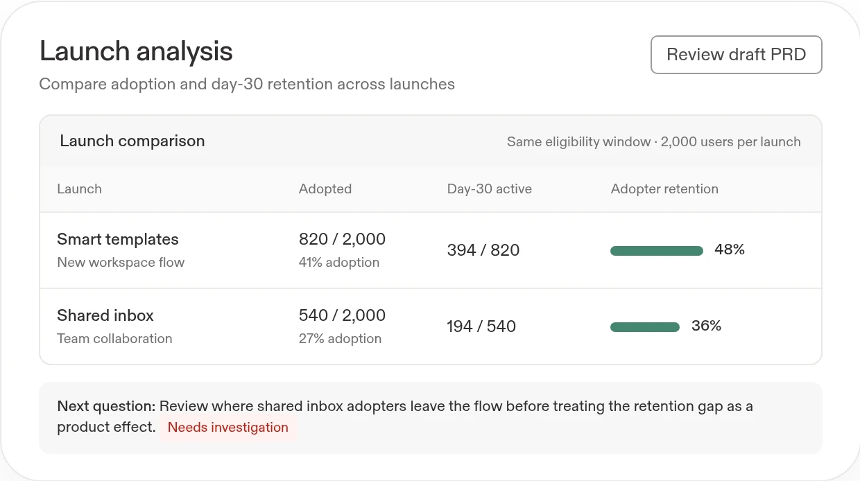
Give teams a clear recommendation they can inspect—not just a static report.
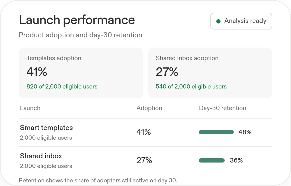
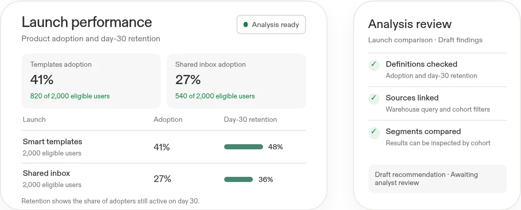
- Compare product adoption and retentionInvestigate launch performance, customer cohorts, and day-30 retention; distinguish the observed result from a proposed explanation.
- Make the recommendation actionableBuild an interactive report, recommend the next step, and turn the findings into a draft PRD or decision brief.
Show your work.
What you'll build
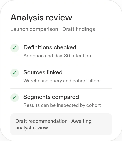
A filterable analysis app with visible metric definitions, source references, recommendations, and a draft product brief.
Compare adoption and day-30 retention for two launches. Build an interactive report, show the relevant segments, recommend what to improve, and draft a PRD.
Works withBigQuerySnowflakeGoogle SheetsNotionGoogle Docs
BigQuerySnowflakeGoogle SheetsNotionGoogle DocsBuild with Replit.
Workflow 02
Financial models and forecast workspaces
Give business owners a reviewable view of performance, assumptions, and risk.
- Compare plans with actualsExplain budget variances and reforecast with revised drivers, separating timing differences from recurring changes.
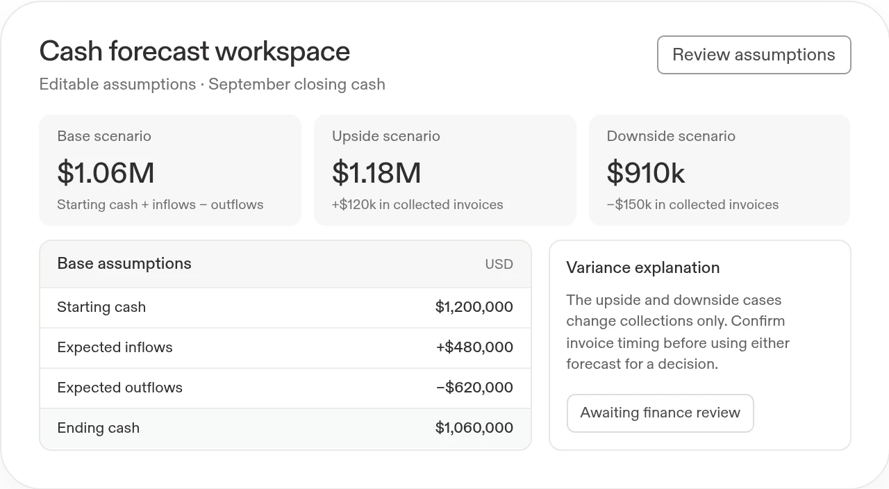
- Model revenue and cash scenariosBuild or update models, forecast cash using editable inflow and outflow assumptions, and show the risks behind the forecast.

Review the
drivers
scenarios
drivers
What you'll build
An editable financial model, scenario comparisons, variance explanations, and a review queue for unresolved inputs.
Build a budget-versus-actual and cash-forecast workspace. Expose the model’s assumptions, explain the variances, and compare base, upside, and downside scenarios.
Works withGoogle SheetsSnowflakeBigQuery
Google SheetsSnowflakeBigQueryWorks withGoogle SheetsSnowflakeBigQuery
Google SheetsSnowflakeBigQueryscenarios

Live workspace
Workflow 03
Metric diagnosis and decision monitoring
Catch important changes and direct attention to the causes worth investigating.
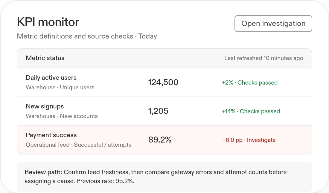
- Investigate a metric changeCheck freshness, joins, cohort composition, and underlying records before treating a change as a business signal.
- Track KPIs and past decisionsDefine measures and thresholds, publish a useful reporting view, and monitor whether the action taken produced the expected result.
What you'll build
A live monitoring app with definitions, quality checks, change history, drill-downs, and an accountable follow-up workflow.
Build a KPI monitor that checks data quality, flags meaningful changes, and provides drill-downs and a recommended investigation path for the metric owner.
Works withBigQuerySnowflakeGoogle SheetsSlack
BigQuerySnowflakeGoogle SheetsSlack ±%From
changes.
To causes.
±%From
changes.
changes.
What you'll build
A live monitoring app with definitions, quality checks, change history, drill-downs, and an accountable follow-up workflow.
Start with this prompt
Build a KPI monitor that checks data quality, flags meaningful changes, and provides drill-downs and a recommended investigation path for the metric owner.
Works withBigQuerySnowflakeGoogle SheetsSlack
BigQuerySnowflakeGoogle SheetsSlackTo causes.
Stop rebuilding the same analysis.Build a reusable data app.

Before
Each question creates a new export, notebook, or deck. Definitions and assumptions drift, and the person receiving the report cannot easily investigate the result.
 With Replit
Build a reusable data app with visible assumptions and drill-downs. Make recurring checks repeatable, while keeping methodology, uncertainty, and business decisions open to review.
Turn recurring analysis into a Replit Routine
Refresh approved KPIs into a dated review with variance explanations and data-quality warnings.
Create a Routine named "Weekly business review refresh" for Fridays at 2:20 PM in my timezone. Before scheduling, confirm approved data sources, KPIs, report template, Drive folder, timezone, and permission to create dated drafts. Refresh the data, recalculate KPIs, compare results with last week and target, and explain the three largest movements. Preserve the template and prior versions; save a dated copy in the approved folder. Return a change summary here with source timestamps and missing-data warnings. Do not modify source records or make financial decisions. Prepare one sample for my review before enabling the schedule.